After visiting the de Young Museum on a field trip with my Archaeology class, I noticed a stark contrast between the “vibe” inside the museum throughout its exhibits and that of the city and people around it.
The de Young is a fine arts museum located in San Francisco, a city historically known for its character, culture, creativity, and color. The museum should emulate the atmosphere of the surrounding city, displaying art with the same vibrancy that is seen outside its walls.
I would like to emphasize the importance of displays, which are commonly (and understandably) less of a focus than the art itself. Displays should enhance the viewer’s experience and add to the art rather than take away from it. Presenting art in a sterile environment, with dim lighting and white walls as if it is a hospital or laboratory, diminishes experiences of art, and must be changed.
The current and original setup of many of these exhibits is understandable and has some positives–keeping space around displayed pieces simple and clean allows viewers to focus on the art, reducing distractions that would hinder the experience. The lights dimmed and focused on the pieces draw one’s attention to the art and away from the space around it; the atmosphere seems serious, calm, and quiet, discouraging people from talking loudly.
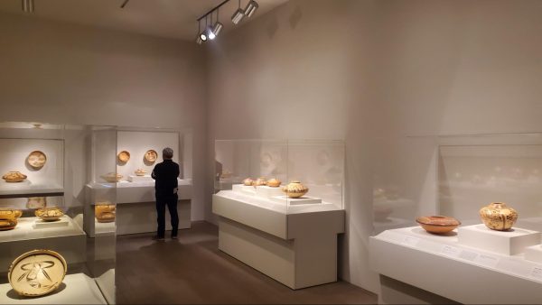
Common display style within the Museum.
However, I would argue that colorful walls, elaborate scenes, and a suitable soundtrack would make these exhibits all the more engaging. Furthermore, I believe that talking, laughing, and any noises made in reaction to the art should be encouraged in museums. The current sterility of the space makes enjoyment seem like a crime. Art is supposed to be fun, it is meant to spark conversation, and it should inspire awe, joy, and emotion.
The current layouts imply that the museum places value on seriousness and, perhaps faux, sophistication over their visitors’ wonder, inspiration, appreciation, etc. It is important to mention that this sterility is only an issue for exhibits displaying older artifacts; this doesn’t seem to be an issue with modern art.
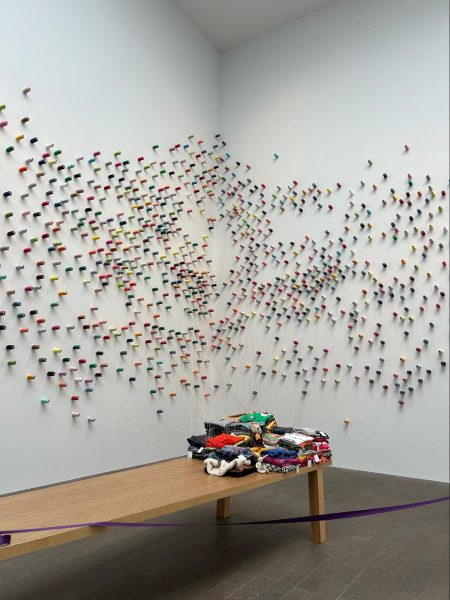
Lee Mingwei’s “The Mending Project”
When I visited, the exhibition Lee Mingwei: Rituals of Care was on display (it will remain until July 7th of this year), and I thought every installment of his art was very interesting–with interactive elements, beautiful arrangements that allowed art to fill the large space around it, various cultural interpretations in art, and more.
A group of us all gasped upon entering the room in which Mingwei’s The Mending Project was displayed, where spools of colorful string were scattered across two large walls, strings from each connected to piles of cloth on the table in the center. We didn’t get to see the event in action, during which a host repairs torn clothes brought in by guests by sewing them with the thread attached to the walls, but it was an exciting scene nonetheless.
My favorite exhibit was a group of paintings, created by artists that Mingwei invited, which reinterpreted Edward Hicks’ Peaceable Kingdom in a variety of styles and cultural lenses. Each unique painting had its own delightful twists and details. How interesting to see how creatively and differently human minds think!
Another exhibit I enjoyed and would make minimal changes to was Contemporary Painting in Papua New Guinea: Mathias Kauage and His Family. Kauage’s paintings, bold and expressive, were beautifully contrasted against the bright red wall they were hung on, capturing my attention immediately upon seeing them. The display’s simple pop of color made these installments the most interesting part of the whole Oceanic art section.
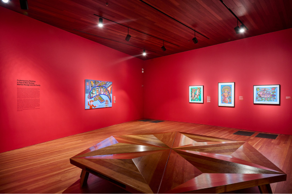
Installation of “Contemporary Painting in Papua New Guinea: Mathias Kauage and His Family”
Unfortunately, these paintings were located in the very back corner of the exhibit, shadowed in brooding lighting amongst the permanent pieces in the section. A temporary piece that offers vibrancy and cultural commentary should be at the front of the exhibit! Additionally, the text that provides context and explains the pieces should be bigger–in fact, this goes for every exhibit, all with so much wall space yet such tiny text.
The rest of the Oceanic art section is a good example of an exhibit I would change drastically. The room that contained all of this art was dark and woody–I suspect the intention was a sort of moodily lit atmosphere but, frankly, it just seemed dull.
Older art tends to be earth-toned and less colorful, perhaps due to erosion and simply aging. Museums should display a prototype or an image of what this art looked like in its original form, bringing in more color and better representing the culture from which it comes. If an art piece is not very colorful in its original form, then the room/display itself should be made more colorful, context should be added to the piece, or something interesting should be done with the lighting to add some dimension and excitement.
For example, figures can be lit in such a way that their shadows appear on the walls, as if they had come to life. I think in this case, the current look of the room is an attempt at a cohesive look, but it simply results in the art blending right into the darkness and wood of the space.
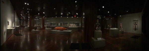
Oceanic Art Collection
Adding physical context to the isolated art pieces would make exhibits more engaging as well. Placing older art pieces in scenes depicting how, where, and by whom they would’ve been used allows visitors to gain a general understanding almost instantaneously. Displays similar to those that the American Museum of Natural History does with its taxidermy animals are what I am picturing.
Ultimately, adding color, interactive elements, context, and sprucing up displays will open up archaeology to a wider audience. Perhaps a big part of the field’s vision problem (the problem being the lack thereof this vision or awareness) is the archaic and, frankly, boring nature in which it is being displayed.
The care and meaningful composition put into the creation of exhibits have an effect on the museum-goer; when the museum invites one to be curious and engage with the art on display, it becomes more of a significant experience.
It is imperative that museums adopt a more communal and engaging display format, especially considering the dismissal of art education as a higher value is placed on STEM fields.
Museums are not movie theaters, one should not be surprised that it is daytime when leaving the building. Away with the darkness, in with the light! The museum should be just as creative and spirited as the people who visit it and the city that encircles it.































Charles Toledo
Jun 29, 2024 at 5:03 pm
Solid Opinion piece! I definitely agree that art should be more engaging, and “more human” if that makes sense.